Groupon’s new discount tool, Clicky the Clickable Value-Wheel, is so ridiculous in both concept and name that it just might have done a 180 and edged its way into being kind of cool. What do you think about this awesomely bad name? Is the emphasis on awesome or bad?
We’re all thinking it, and many of us are saying it: Netflix, what are you thinking?
The division of Netflix into two brands — one for streaming, one for DVD-by-mail — seems to have rocked the nation. As always, people are averse to change. The Netflix customer got used to a certain level of service for an incredible price, then studios realized there was much more profit to be made for licensing their content, and prices went up for Netflix and ultimately the customer. It stinks, but so it goes.
The business decision is not what the Name-caller is questioning. What interests me is the attention the new DVD-by-mail brand name is getting. There appears to be a visceral dislike of the name Qwikster. Some say it sounds straight out of the 90s; others say it just sounds lame. What’s going on here?
I’ll start with what I see as the biggest problem: The name says almost nothing. The only communication point conveyed by Qwikster is speed. Speed is great, and yes, those DVDs do arrive in my mailbox posthaste, but a much better communication point to convey here would been something even more literal: specifically, movies, DVDs, or mail. Netflix isn’t a particularly exciting name, but it works well because it clearly describes the service of providing flicks through the internet. Qwikster could be anything: muffin mix, an ISP, a low-budge sports car, an insulin pen, you name it.
The rest of the issues in this name can be rolled into the aforementioned general consumer complaints of lameness and 90sness. Each element of the name is dated and/or over-saturated. In fact, The Simpsons has been parodying this type of name with its Kwik-E-Mart convenience store since about 1990. We can see a very similar treatment of the word “quick” here with the use of “w” and the omission of “c.” We’re also reminded of good old Nestlé Quik (emphasis on old — the product is now known as Nesquik). The “-ster” suffix can be fun when used intelligently (e.g. Porsche Boxster), but in this case it is wasted.
Another thing wasted here is an opportunity: the opportunity to tie into the Netflix name. Something in the vein of Mailflix or Postflix may have been a better direction. Even Netquix or QwikFlix might have been a slight improvement if they insisted on a lame name. I realize they’re attempting to clearly separate the two brands, but frankly their DVD-by-mail service was well-loved by customers and the Netflix name had many positive associations.
Alas, here we are. Lame. 90s. Qwikster.
As Urban Oufitters prepares to launch their new bridal collection (more aligned with the Anthropologie brand than the Urban Outfitters brand, naturally), many 20-something ladies are oohing and ahhing with excitement. Me? I’m just confused.
The name of the label is BHLDN. At first glance, you might just want to pronounce the name as a string of letters, but think really hard and you’ll remember this naming trend from about 2004-2008: the case of the disappearing vowels. It was all the rage. Remember how cool the Motorola phones were? RAZR, KRZR, SLVR. Flickr was brand new, and that missing “e” was so hip. The vowel-free names generally signaled a tech brand, although there was some branching out from that pattern to target young [tech-savvy] consumers in non-tech categories, such as the bag company TRKFLD.
Yes, Flickr and TRKFLD are still around, and perhaps there are some Baby Boomers out there who are still clinging to their RAZRs, but this naming construct is just as much of a relic of the past as a flip phone is. Today’s names are fresh and authentic. “Beholden” is a beautiful, timeless name that would also be perfectly on-trend today. But BHLDN? That’s so 2000 and late. Of all the names that should aim for long-lasting relevance, a bridal line really ought to be up there. You’re so close, yet so far, Urban Outfitters. Please, buy a couple vowels and join us in 2011.
Are you familiar with Idealist.org? I was just working on creating names when the word “idealist” popped into my head and I remembered what an inspiring organization this is. It’s basically a directory for people who want to make the world a better place; it connects people with volunteer opportunities and jobs in the non-profit sector. In short, it’s great.
More important (I kid… or do I?), it has an awesome name. I crush hard on this name. It’s a list of ideas – an idea list! – for idealists. A clever name with two totally appropriate, descriptive meanings that doesn’t sound forced? Yes. From this Name-caller’s perspective, this is as good as a name can get.
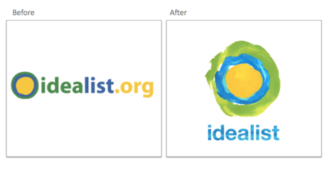
I just went to the website to see how Idealist has been doing since my unfortunate two-year hiatus from using the site, and I found a number of changes that were implemented in 2010. Functionally, there are some great updates to make connecting people and organizations easier than ever. But design-wise, I was a teensy bit disappointed with the updated wordmark. Take a look at the before and after:
The clever name was highlighted nicely in the previous incarnation through smart use of color. The “idea list” meaning was made evident through the color shift, but the “idealist” meaning was also given importance by using blue and green, similar colors, to tie the two parts together. This was clearly an intentional move and worked quite well. Now, there is still a bit of a color shift going on in the middle of “idealist” in the new version, but it’s extremely subtle. On the website itself, there is no color shift at all in the treatment of the name.
Of course brands need to evolve. Maybe I’m just having a little trouble accepting change. After all, the double meaning is still there, and it’s still one of the best names out there. But I sure did like the cooperation between the name itself and the design in that old wordmark.
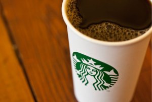
It looks like Starbucks considers their foray into unbranded coffee shops (such as their 15th Avenue Coffee & Tea café in Seattle) a success – they’re extending the stripped-down approach to the Starbucks brand itself. That’s right. Starbucks unveiled their new logo today, and while the iconic siren appears unchanged from the previous incarnation, the name itself has vanished.
You might expect the Name-caller to be upset to see a name disappear, but I actually find the update refreshing. The Starbucks name and logo are known well enough that the lack of a name on the cup won’t put a damper on brand recognition. For better or for worse, “Starbucks” is synonymous with “coffee” for many.
We’ve all joked about the frightening ubiquity of Starbucks, and frankly, I think a bit of unbranding is just what the doctor ordered to advance the brand. Just as the aforementioned not-Starbucks-but-actually-it-is-Starbucks cafés were a welcome breather, I think the new stripped-down, name-free logo will perk us all up.
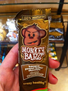
How adorable and awesome is the name Monkey Bars for a line of granola bars? This brand is absolutely killing it for me. I can’t decide what my favorite piece of their identity is: that name, the tagline “Crazy Healthy,” or the fact that they offer a Banana Peanut Butter Chocolate flavor (every monkey’s favorite!).
The maker also offers oatmeal called (are you ready?) Monkey Brains.
Have you noticed? The Yellow Pages brand has undergone a major overhaul this year. The transition of this classic paper-based brand into the digital age is really quite impressive. If you follow branding news, you’re likely aware of the logo shift earlier this year: the book was removed from beneath the fingers in the famous Walking Fingers™ logo, and the image was made a bit more abstract.
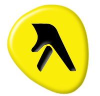
AT&T didn’t stop there, though. In order to signal a major shift in the brand, they’ve also undergone a name change. While the Yellow Pages name technically could have fit well with the new digital brand (websites are composed of pages, after all), that name has been associated with obsolescence over the past ten years as people turned more to the interwebs and the physical Yellow Pages were only seen in stacks sitting in the lobby of apartment buildings for weeks, never to be picked up by the tenants. The entity formerly known as Yellow Pages is now officially “yp.” (And the Walking Fingers™ logo is nowhere to be found on the redesigned website.)
As you might expect, I have some thoughts on this new name:
The Good
- There is a tie to the original name. While a shift away from the Yellow Pages name was necessary, there is way too much history and equity tied to that name to lose it completely.
- It’s short. Very short.
- It’s very easy to pronounce. It’s just letters of the alphabet placed together, like BP or KFC, and there isn’t a cognitive desire to try to turn them into a word (i.e. to pronounce them as “yip” or “yup”).
- It’s reminiscent of texting language. It immediately reminds me of “yt?” (meaning: “you there?”). This fits well with the digital shift.
The Bad
- It is a forced nickname. The long-ago shift from Kentucky Fried Chicken to KFC worked well because consumers gave their beloved fast food chain that nickname, and the chain adopted it in turn. Similar to McDonald’s adopting Mickey D’s in recent advertising. Consumers like to be involved in the life and evolution of the brands they love. This “yp” feels somewhat forced to me; I have never heard anyone refer to Yellow Pages as “yp.” Personally, I would have liked to see it just move to “Yellow.”
- Actually, I think that’s the only bad thing about it. Except for the really-pretty-bad thing.
The Ugly
We’re all thinking it; I’ll guess I’ll come out and say it. “YP” = “why pee.” In fact, it’s the only reason I noticed the commercial that alerted me to the latest evolution of the brand. I heard a man’s voice say “why pee,” my head snapped up to see if this was a commercial for some sort of urinary tract medication or possibly a Saturday Night Live fake commercial, and I started giggling. Silly? Yes. But this is a major brand, and to hear “yp” as “why pee” requires absolutely no stretch of the imagination: they’re phonetically identical. It’s just begging to be mocked.
Overall, I still truly think the brand has done a superb job of evolving. Saving this iconic brand from becoming obsolete was a huge undertaking. It’s just too bad those involved in the naming were too shy to point out the 800 pound gorilla urinating in the room.
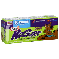 Here’s one for the Genius Names file. Yoplait’s Go-Gurt brand of squeezable yogurt for kids gets a special name for its special edition Scooby-Doo flavor: Ro-Gurt. I’m squealing with delight.
Thanks to SlummiestMummy (extraordinary mother of two, always on top of current kids’ brands) for calling this to my attention.
Image via wegmans.com
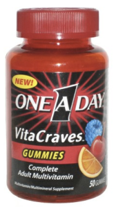 Do you have trouble remembering to take vitamins? I hate swallowing pills, so I find myself conveniently forgetting at least 350 days a year. This all changed recently when I picked up a bottle of One A Day VitaCraves, a gummy multivitamin for adults. It has been scientifically proven that gummy candy is the best candy in the whole world, so I have not missed a single day of vitamins since I made the purchase. I love these vitamins so much that after a few days I started thinking that it was a shame I only needed “One A Day.” I couldn’t get this thought out of my head, and it got me to wondering whether a brand with such a clear name would even include directions on the package. Well, I checked. Imagine my shock when I read the following:
Chew two gummies daily.
Pardon? Two a day? Oh, the conflicting feelings! My deep desire to consume two of these delicious vitamins is now a reality, but the “One A Day” name is a total sham! Let’s take a look at what happened here.
First of all, let’s be kind to One A Day: the name has been successful for decades. It has achieved more longevity than many other brand names. But that doesn’t preclude us from learning a lesson. One of the important things to consider when creating a name is its flexibility. Might the name you’re creating be limiting if your brand expands? You might face some problems down the road if you tie your name to a specific technology (Blockbuster Video had to drop the “Video” from retail store names), to a time of day (Lunchables‘ foray into pre-packaged breakfasts under the same brand name unceremoniously disappeared), or to anything else that could cause confusion and/or prevent the brand from achieving credibility with expansion.
One A Day is a perfectly good name with a great deal of equity, and it works very well for all their one-a-day vitamins. The directions are contained in the name – great! But frankly, it’s quite misleading for two-a-day vitamins. I went several days unknowingly missing out on half of my daily vitamins and was not entirely pleased that what I thought was a 50 day supply turned out to be a 25 day supply.
If I had been name-calling many years ago when One A Day was created, I might have advised the parent company to consider whether they might ever offer products with a different daily dosage. But at this point, given the substantial history and equity in this name – and the fact that the two-a-day directions appear to apply only to gummy vitamins – I certainly don’t think it’s necessary to jump ship and come up with a new name. In fact, I’ve got a much better solution: make the gummy vitamins twice as big.
Image from http://www.theimpulsivebuy.com
